

An illusion image is one that shows a scene up close and a hidden pattern from across the room — a spiral, a word, a logo — without either reading as pasted on. The technique is straightforward once you understand that you are steering brightness, not shape. This walks through building the control image, the three settings that decide whether the effect lands, and the subjects that refuse to cooperate.
The mechanism: you are painting with luminance
The illusion is produced by a ControlNet model, most commonly the family known as QR Monster, published in 2023 by monster-labs to hide scannable QR codes inside generated artwork. Making a code scannable and making a spiral visible from a distance are the same problem: force the light and dark regions of the finished image to follow a supplied map, while letting the model fill those regions with plausible scene content.
That is why the effect survives at a squint. Your eye at low spatial frequency sees only the overall light-dark structure, which the ControlNet has forced into a spiral. Up close, the high-frequency detail — roof tiles, foliage, faces, window frames — dominates and the spiral disappears into ordinary scenery.
The useful consequence: everything you do to make the illusion stronger is about tonal contrast, and almost nothing about the prompt.
Building a control image that works
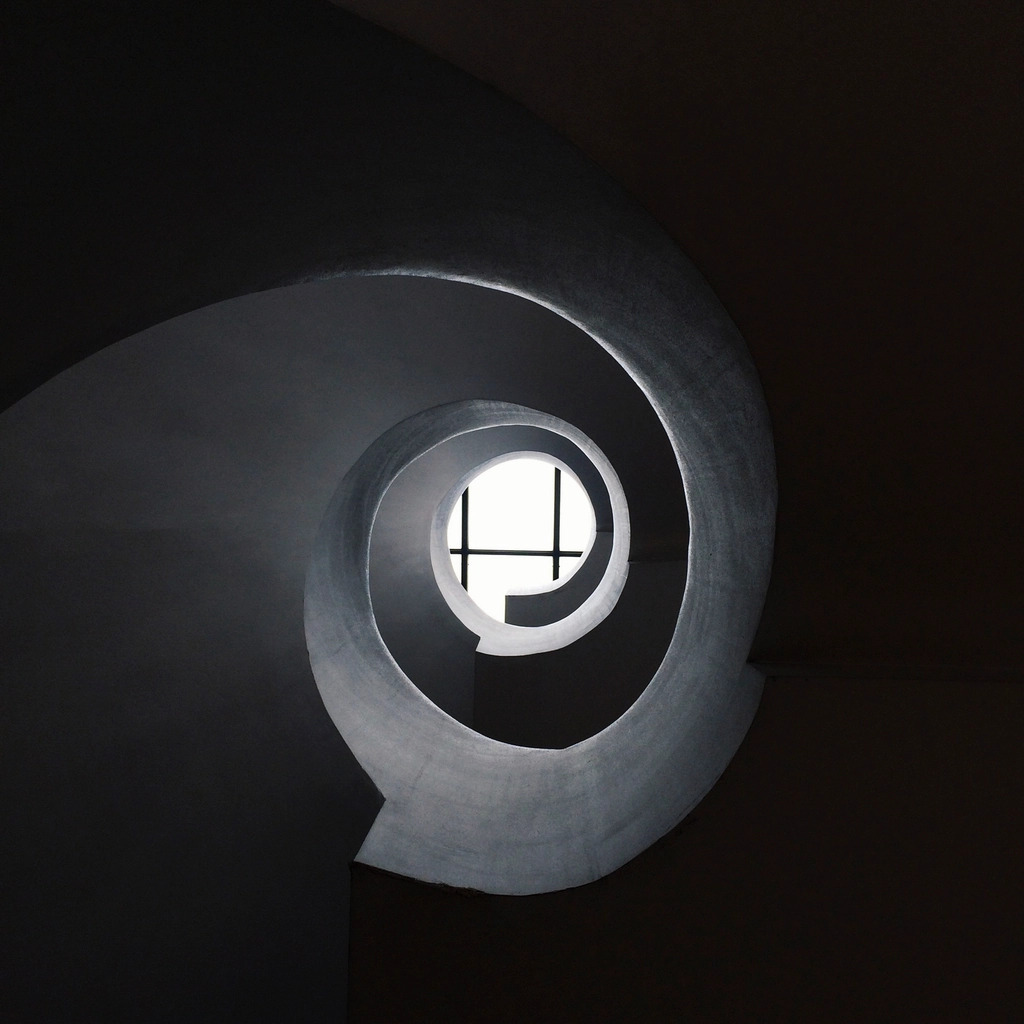
The control image is a greyscale map. White areas become bright parts of the picture, black areas become dark ones. Any image editor will produce one; there is no need for a plugin.
- Make a square canvas at the resolution you intend to generate — 768 or 1024 on a side is comfortable.
- Draw the pattern in pure black and white. A spiral, concentric rings, large block text, or a simple silhouette all work.
- Keep the stroke thick. A spiral arm two or three pixels wide will vanish; one that is a twentieth of the image width will survive.
- Apply a Gaussian blur of a few pixels. Hard edges make the model produce visible seams, and slightly soft edges give it room to hide the transition inside real detail.
- Check the contrast is genuinely full-range black to white, not dark grey to light grey.
A useful discipline: shrink your control image to a 64-pixel thumbnail. If the pattern is not instantly legible at that size, it will not be legible in the finished illusion either.
Settings that decide the outcome
Three parameters carry almost all the weight. Everything else is ordinary generation config.
| Setting | Starting value | What it does |
|---|---|---|
| ControlNet weight | 1.0 to 1.4 | How hard the pattern is enforced. Below 0.8 the illusion fades; above 1.6 the scene turns into a painted spiral |
| Start step | 0.0 to 0.1 | Early engagement locks composition around the pattern |
| End step | 0.7 to 0.9 | Releasing before the end lets the final steps restore texture and hide the seams |
The end step is the one people leave at default and then wonder why their images look like a spiral with a village texture-mapped onto it. Ending ControlNet guidance around 0.75 gives the sampler its last quarter of denoising to reassert real detail over the imposed structure.
Run several seeds. The success rate on this technique is genuinely low — one strong result in six or eight attempts is normal, and no amount of parameter tuning changes that, because whether the pattern happens to land on usable scene features is partly luck.

Subjects that survive, subjects that do not
The model needs somewhere to hide the pattern. That means scenes with dense, irregular, high-contrast detail spread across the whole frame.
Works well: aerial views of medieval villages and old towns, forests with mixed light and shade, night cityscapes, crowds, rocky coastlines, ornate interiors, machinery.
Works badly: single-subject portraits, anything with a large flat sky or plain wall, minimalist compositions, studio product shots. A face has too little internal contrast to absorb a spiral arm, so the arm sits on top of it and the illusion breaks in the most obvious way possible.
Style choice helps too. Ink wash, woodcut, engraving, and other high-contrast monochrome idioms give the ControlNet plenty of native tonal range to work with. This prompt, written for SDXL, produces exactly that kind of tonal material and makes a good base to experiment on:
ink and wash | a figure standing in the middle of drifting smoke, viewed from above, black and white, smooth tonal gradient, ultra detailed, dramatic lighting, painterly, textural, artistic
With the matching negative prompt, which mostly exists to keep flat artefacts out of the tonal range you care about:
watermark, text, deformed, blurry, low contrast
On a Stable Diffusion 1.5 checkpoint you would drop the resolution and expect a softer result; on SDXL it holds detail well enough that the illusion has real texture to hide inside. Note that QR Monster ships as separate weights for SD 1.5 and for SDXL — take the one matching your base model, since a mismatched ControlNet either errors out or produces noise.
Verifying the illusion
Do not trust your own eyes on the full-size image. You already know where the pattern is, so you will see it whether or not anyone else would.
- Downscale to a 100-pixel-wide thumbnail and look at that.
- Or apply a heavy Gaussian blur and check the pattern is still readable.
- Or step physically back from the monitor by a couple of metres.
If the pattern survives all three, it will read on a phone feed, which is where these images are usually seen.

Common failure modes
Pattern visible as painted-on lines. Weight too high, or the ControlNet is running to the very last step. Lower weight by 0.2 and pull the end step back.
Nothing visible at all. Weight too low, control image contrast too weak, or a subject with nowhere to hide the pattern. Fix the control image first.
Scene ignores the prompt entirely. The ControlNet is overpowering conditioning. Reduce weight and raise the start step slightly.
Ugly seams along the pattern edges. Blur the control image more.
Practical takeaways
- Treat the control image as the real work — full black-to-white contrast, thick strokes, slight blur.
- Start at ControlNet weight 1.2, start step 0, end step 0.75, and adjust one at a time.
- Pick scenes with dense irregular detail; portraits and flat backgrounds will not work.
- Batch seeds rather than tuning parameters. Most attempts fail, and that is expected.
- Judge every result as a thumbnail, never at full size.




Top comments (0)