

A product video can show everything and still leave viewers wondering why the product matters.
You see the product, someone uses it, and the video ends with a polished shot. But the reason to care never becomes clear.
When planning a product demonstration with the Kling 4.0 AI Video Generator, I'd rather start with one simple question: what should viewers notice by the end that they couldn't see at the beginning?
Take a desk organizer as an example.
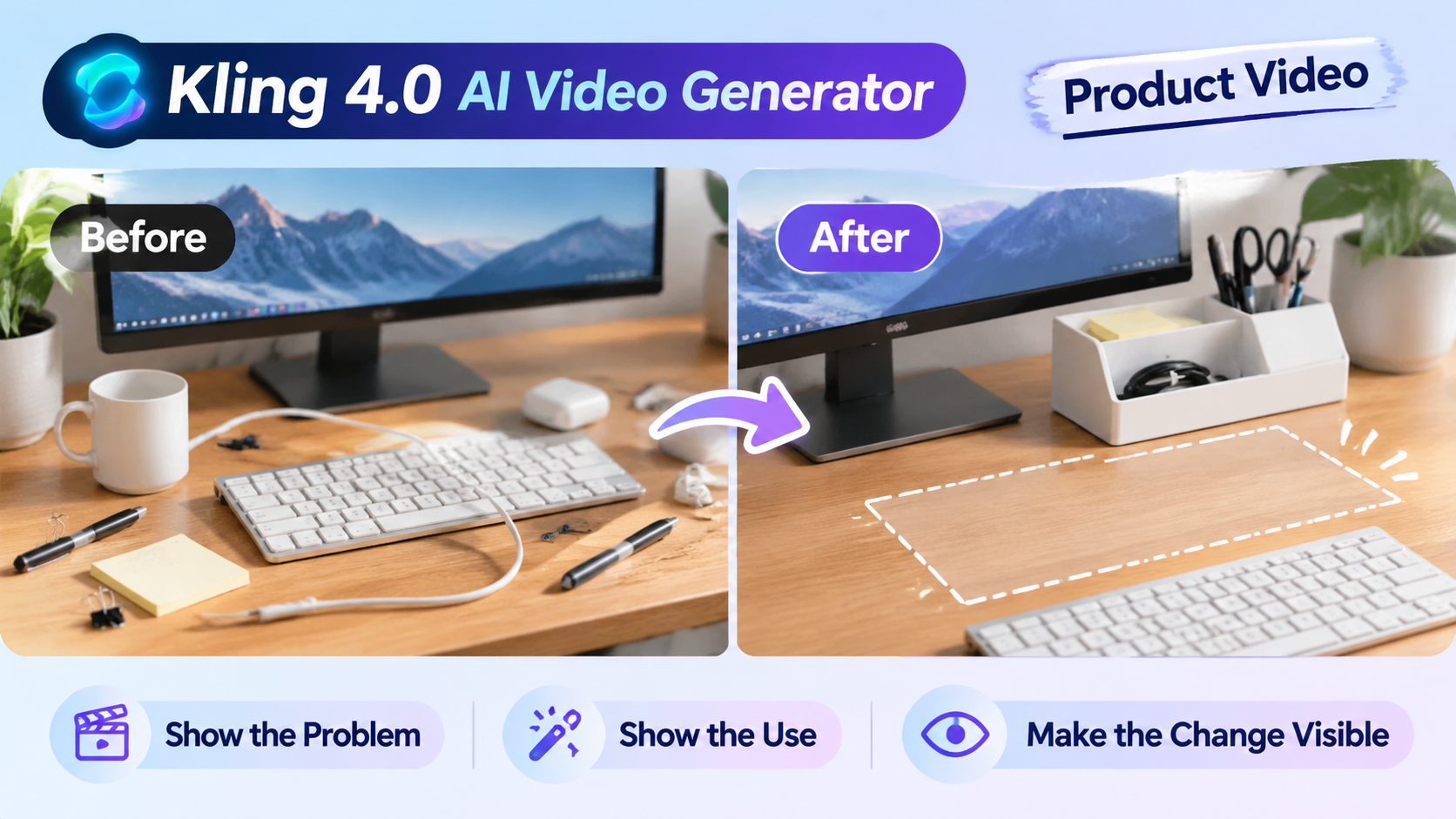
The Product Was Visible, but the Problem Wasn't
Imagine a desk with a charging cable stretched across the keyboard, pens scattered near the monitor, and a few small items taking up the space where someone normally works.
Now imagine opening a product video with a close-up of a desk organizer.
The product looks good, but viewers have no reason to care about its compartments or design yet. They haven't seen the problem it is supposed to solve.
I'd start with the desk instead.
The cable is in the way. The pens have nowhere to go. The workspace feels a little crowded. Nothing dramatic, just an everyday situation that people recognize.
That gives the product a reason to appear.
Show One Change That People Can Actually See
For the middle of the video, I'd focus on one straightforward action.
A hand places the pens into the organizer, moves the loose accessories into their compartments, and clears the space in front of the keyboard.
I wouldn't try to demonstrate every feature in the same sequence. The viewer only needs to understand what the product does in this particular situation.
The final shot should return to roughly the same camera angle as the opening.
The monitor stays in place. The desk surface is unchanged. The difference is that the charging cable is out of the way, the pens are organized, and there's more usable space in front of the keyboard.
That comparison makes the result easier to understand than another unrelated product close-up.
Planning the Important Moments with Kling 4.0
For this type of video, I'd plan a few important visual moments before writing the full generation prompt.
Kling 4.0 supports up to 10 keyframe image inputs, so creators can define important visual states along the video timeline. There's no need to use all ten for a simple product demonstration.
I'd start with three:
Opening: The original cluttered desk.
Middle: The organizer being used.
Ending: The same desk with the workspace cleared.
The keyframes give the sequence clear visual reference points. I'd then describe the action between them in straightforward language rather than trying to explain every tiny movement.
One detail I'd pay attention to is the relationship between the frames. The monitor, desk color, and product should remain recognizable throughout the sequence. Otherwise, viewers may feel like they're looking at three different scenes rather than one product demonstration.
Kling 4.0 provides more room to plan these visual changes, but the generated result still needs to be reviewed. Keyframes guide the sequence; they don't guarantee that every detail will be reproduced perfectly.
One Check Before Calling the Video Finished
I'd watch the finished video once without reading its caption or supporting text.
Can I understand what problem the product addresses? Can I see how it is used? Is the difference clear by the end?
If not, I'd look at the sequence again before adding another shot.
Sometimes the opening needs more context. Sometimes the product's actual use needs more screen time. Sometimes the final view needs to match the opening more closely.
For real product demonstrations, I'd also compare labels, packaging, dimensions, and other important details with the actual product before publishing.
A product video doesn't need to show everything.
It needs to make the important difference easy to see.






Top comments (0)