
One thing that slowed down my design process wasn't drawing interfaces.
It was deciding which direction to explore.
Before opening Figma, I'd often spend 30–40 minutes looking for inspiration, collecting screenshots, and sketching rough layouts.
Most of those ideas never made it into the final design.
I wanted a faster way to visualize concepts before committing to a full UI.
That's when I started experimenting with AI image workflows.
What
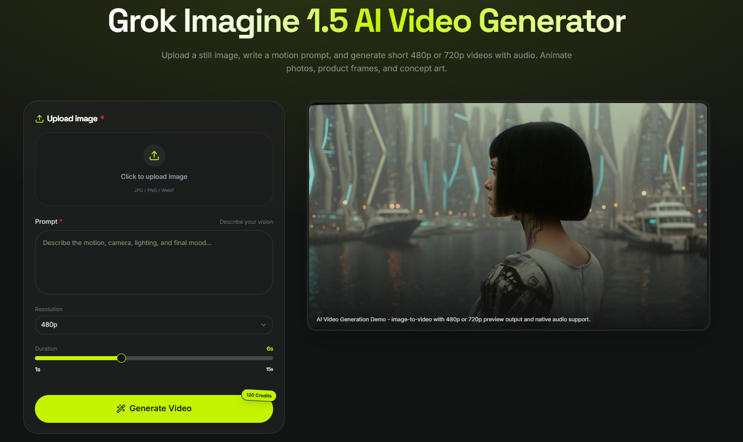
Recently I've been using Grok Imagine 1.5 as an idea-generation tool rather than a finished design tool.
Instead of asking it to create polished mockups, I use it to explore visual directions.
Some capabilities that fit this workflow include:
- Text-to-image generation
- Style exploration
- Reference-based editing
- Multi-image refinement
- Image-to-video support for later iterations
Grok Imagine is designed to support an end-to-end visual workflow, from image generation and editing to animation.
How
Step 1: Describe the Product
Instead of listing UI components, I describe the product and the user experience.
Example:
A modern fitness app focused on simplicity, soft gradients, rounded cards, clean typography, and a calming color palette.
Step 2: Describe the Mood
This changed my results more than adding extra keywords.
Example:
bright morning light, minimal workspace, premium mobile app aesthetic, subtle shadows, Scandinavian design inspiration
Prompt guides for Grok Imagine recommend writing prompts as natural scene descriptions that include mood, lighting, and context rather than keyword lists.
Step 3: Generate Several Directions
Instead of searching for one perfect image, I usually create:
- minimalist version
- dark mode version
- colorful startup style
- premium enterprise style
This gives me multiple directions before I begin designing.
Step 4: Rebuild in Figma
Once I find a visual direction I like, I recreate the layout manually in Figma.
The AI output isn't the final design.
It's the creative starting point.
Example Prompt
modern mobile banking app dashboard, clean card layout, soft blue gradient, rounded interface, premium fintech branding, realistic smartphone presentation
Use Case
This workflow has been useful for:
UI/UX Designers
Exploring layout concepts quickly.
Startup Founders
Visualizing MVP ideas before hiring a designer.
Product Teams
Creating mood boards for discussions.
Freelancers
Presenting multiple design directions to clients.
App Developers
Planning interfaces before implementation.
Why
After several projects, I noticed a few improvements:
- Less time searching for inspiration
- Faster concept validation
- More creative variations
- Better communication with clients
- Smoother transition into Figma
The biggest improvement wasn't image quality.
It was reducing the time spent deciding where to start.
Final Thoughts
I don't use AI to replace interface design.
I use it to remove the blank-page problem.
If you're designing apps, dashboards, or web products, try generating a few visual concepts before opening your design tool.
You might spend less time searching for inspiration and more time refining ideas that already have a clear direction.





Top comments (0)