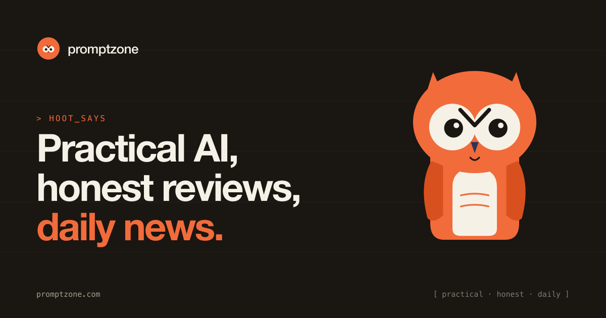


Last week we shipped a quiet refresh of promptzone — a warmer palette, cleaner typography, and a mascot named Hoot. This post is a short walk-through: what changed, why, and what stayed the same.
No hype. We didn't pivot. The product is the same: a community for people who write prompts, build with LLMs, and want honest reviews of the tools they ship with.
Why a refresh
The old visuals leaned generic-AI — gradients, neon, the same "futuristic" template you see on a hundred landing pages. That's not the room we're trying to be. The audience here is shipping production work and reading dense pages on weekends. Generic AI aesthetics undersell that.
Three goals drove the redesign:
- Lower the visual noise. A reader should land on a comparison post and feel like they're in a documentation site, not a product launch. Warm paper background, ink text, one accent colour.
- Make the brand human. Promptzone is an opinionated community, not a faceless aggregator. A mascot signals tone faster than a wordmark ever will.
- Stay readable on every surface. The same kit has to work as a 1200×630 OG card, a 400×400 X avatar, a Discord banner, and a 600×180 email signature. The palette and the wordmark scale; gradients don't.
Meet Hoot
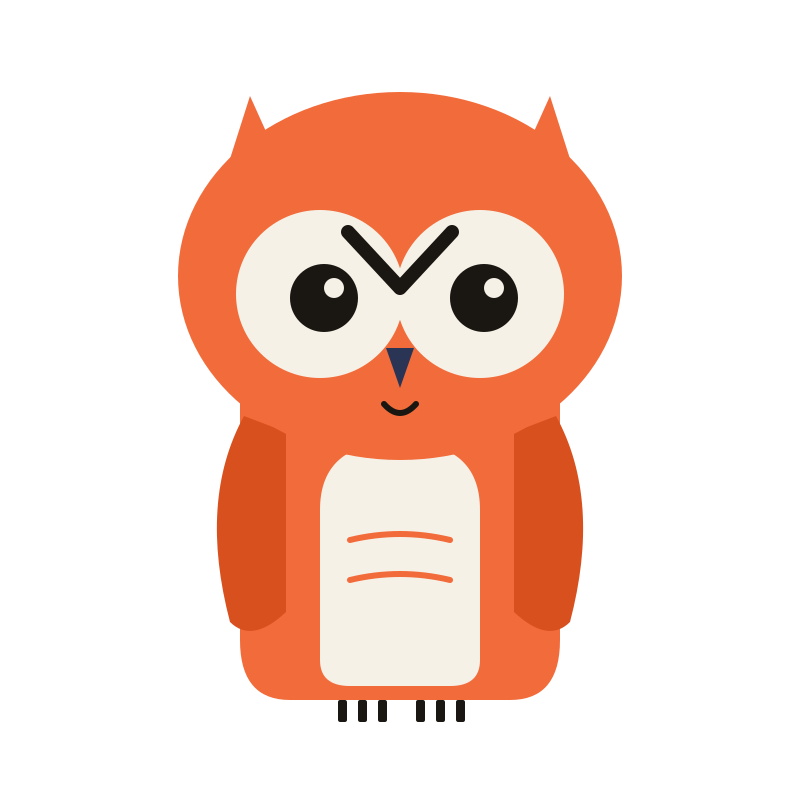
Hoot is an owl. Orange body, bone-coloured belly, navy beak. The shape language is rounded and friendly — closer to a children's book than a startup logo, on purpose. Owls read as wisdom + curiosity, which is the posture we want every post on the site to take.
We considered a robot, an octopus, a fox, and a small abstract glyph. The owl won because:
- It's specific enough to remember after one look.
- It has obvious expression (eyes, brow, beak) for future variants — concentrating, surprised, pointing at a chart.
- Owls don't carry baggage in the AI space. No vendor owns the metaphor.
Hoot will show up on social posts, OG images for new articles, and occasionally inside the writing itself when a side comment is worth flagging.
The system (in three lines)
-
Palette — Hero
#F26B3A, ink#1A1612, paper#F6F1E7, beak navy#2A3556used sparingly. - Type — Geist for display and body, JetBrains Mono for kickers, code, and metadata.
- Voice — Practical · honest · no-hype. If a sentence sounds like marketing, it gets cut.
The full kit covers OG images, X / LinkedIn / Instagram / Facebook / YouTube / Discord / GitHub / email — eight surfaces, one identity. Anyone publishing on behalf of promptzone can ship a correctly-branded asset in under a minute.
What stayed the same
- The URL structure. Existing posts and their slugs are untouched. No redirects, no broken links.
- The author network. Every contributor and their post history is preserved.
- The editorial bar. We're still publishing comparison posts with verified numbers, hands-on tutorials, and honest reviews — that doesn't change because the colours did.
What's next
- Pillar pages for Claude, prompt engineering, AI coding, local LLMs, and AI agents — already live, now sitting under the new visual system.
- A weekly digest in the same voice: practical, honest, no-hype. Five things worth your attention, no breathless takes.
- Hoot variants for category landing pages — a slightly different expression per pillar so the topic is legible at a glance.
If something looks off — a stale logo cached somewhere, a dark-mode contrast issue, a page where the old brand leaked through — reply on this post or open an issue. Small fixes are easy now; they compound otherwise.
Thanks for being here.
— Adif





Top comments (0)