
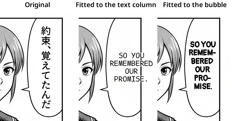

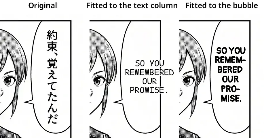
In one of our sample manga pages, the Japanese line 約束、覚えてたんだ sits in two slim vertical columns. Translate it as “So you remembered our promise” and you get a horizontal line with a ten-letter word in the middle. In AI Manga Translator, using the old text box as the boundary squeezed the English into a strip of space much narrower than the actual speech bubble.
Measure the space around the text
Once the original lettering is erased, we use OpenCV connected components to look for a light, closed region around the detected text. An area touching the page edge is rejected. This keeps white space between panels from being mistaken for the inside of a bubble.
An oval is usually narrower at the top and bottom. For each line, we find the horizontal span common to all pixel rows that line will occupy and let the lettering use 84% of it. If a line spans rows whose common width is 100 pixels, its text budget is 84 pixels. A middle line with 140 pixels available gets about 118 pixels. Those figures illustrate the layout rule.
Choose breaks after measuring words
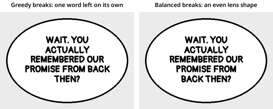
We measure text with Pillow’s font metrics and compare possible breaks for a given number of lines. If two breaks fit, the renderer favours the one that leaves less uneven space across the available widths. That gives the wide middle of a bubble room for more text and helps avoid a short word stranded on the final line.
There are still cases where the bubble-aware layout steps aside. A sound effect over artwork may have no closed region to measure. If detection finds several separate text regions in the same bubble, we keep the upstream placement for those regions. Both are useful cases to include in a lettering review alongside a clean oval bubble.
If you are testing a manga translation pipeline, keep the translated sentence and font fixed and compare only the wrapping. On a narrow bubble, check the smallest line, the space around the outline, and the placement of the longest word. The full typesetting walkthrough shows the intermediate layouts using the same example.
AI was used to draft and localize this article from the project’s implementation and published examples.





Top comments (0)